整理了平时开发常用的 CSS 长度单位详解,聚焦实际开发高频场景,附带可直接复用的代码案例
一、核心单位:90% 项目都离不开这 5 个
1. px(像素)
定位:精确控制固定尺寸
高频场景:
边框、阴影等细节修饰 小图标、分割线等微小元素
.btn {
  padding: 8px 16px;    /* 按钮内边距固定 */
  border: 1px solid #ddd;
  box-shadow: 2px 2px 4px rgba(0,0,0,0.1);
}
2. rem(根字体倍数)
定位:响应式布局的核心单位
开发技巧:
设置根字体为 62.5%(默认16px→10px)简化计算结合媒体查询实现断点调整
html { font-size: 62.5%; }  /* 1rem = 10px */

@media (min-width: 768px) {
  html { font-size: 70%; }   /* 1rem = 11.2px */
}

.card {
  width: 24rem;     /* 240px (10*24) */
  margin: 1.6rem;   /* 16px (10*1.6) */
}
3. %(百分比)
定位:父容器相对布局
核心规则:
width/height基于父内容区尺寸padding/margin基于父容器 宽度(包括垂直方向)
.parent {
  width: 1200px;
  height: 600px;
}

.child {
  width: 33.33%;     /* 400px */
  height: 50%;       /* 300px */
  padding: 5%;       /* 60px (1200*5%) */
}
4. vw / vh(视口单位)
定位:全屏/响应式适配
高频场景:
全屏轮播图、弹窗 字体/间距的视口动态调整
.hero-section {
  width: 100vw;     /* 撑满视口宽度 */
  height: 100vh;    /* 撑满视口高度 */
}

.title {
  font-size: clamp(2rem, 5vw, 3rem); /* 动态字体:5%视口宽度,限制在2~3rem */
}
5. calc()(动态计算)
定位:混合单位灵活计算
经典公式:
.sidebar {
  width: calc(100% - 250px);    /* 右侧留250px空间 */
  height: calc(100vh - 80px);   /* 扣除顶部导航栏 */
}

.grid-item {
  width: calc((100% - 2rem) / 3); /* 三列网格,间距共2rem */
}
二、高频实战场景代码
场景 1:响应式布局
<!DOCTYPE html>
<html lang="zh-CN">
<head>
<meta charset="UTF-8">
<meta name="viewport" content="width=device-width, initial-scale=1.0">
<title>响应式布局示例</title>
<style>
/* 重置默认样式 */
* {
margin: 0;
padding: 0;
box-sizing: border-box;
}
/* 容器布局 */
.container {
max-width: 1200px;
margin: 0 auto;
padding: 20px;
}
/* 导航栏 */
nav {
background: #333;
padding: 1rem;
}
.nav-list {
display: flex;
list-style: none;
gap: 2rem;
justify-content: center;
}
.nav-lista {
color: white;
text-decoration: none;
font-size: 1.1rem;
}
/* 主要内容区域 */
.main-content {
display: grid;
gap: 2rem;
margin: 2rem0;
}
/* 卡片布局 */
.card {
background: #f5f5f5;
padding: 1.5rem;
border-radius: 8px;
box-shadow: 02px5pxrgba(0,0,0,0.1);
}
/* 侧边栏 */
.sidebar {
background: #eee;
padding: 1.5rem;
border-radius: 8px;
}
/* 页脚 */
footer {
background: #333;
color: white;
text-align: center;
padding: 1rem;
position: fixed;
bottom: 0;
width: 100%;
}
/* 响应式设计 */
@media (min-width:768px) {
.main-content {
grid-template-columns: repeat(auto-fit, minmax(300px, 1fr));
}
}
@media (max-width:767px) {
.nav-list {
flex-direction: column;
align-items: center;
gap: 1rem;
}
.card {
margin-bottom: 1rem;
}
}
/* 图片响应式 */
img {
max-width: 100%;
height: auto;
display: block;
}
</style>
</head>
<body>
<nav>
<div class="container">
<ul class="nav-list">
<li><a href="#">首页</a></li>
<li><a href="#">产品</a></li>
<li><a href="#">服务</a></li>
<li><a href="#">关于我们</a></li>
</ul>
</div>
</nav>
<main class="container">
<div class="main-content">
<article class="card">
<h2>最新消息</h2>
<p>这里是主要内容区域,展示网站的最新动态和重要信息。</p>
</article>
<aside class="sidebar">
<h3>侧边栏</h3>
<ul>
<li>相关链接1</li>
<li>相关链接2</li>
<li>相关链接3</li>
</ul>
</aside>
</div>
</main>
<footer>
<div class="container">
<p>© 2025 公司名称 版权所有</p>
</div>
</footer>
</body>
</html>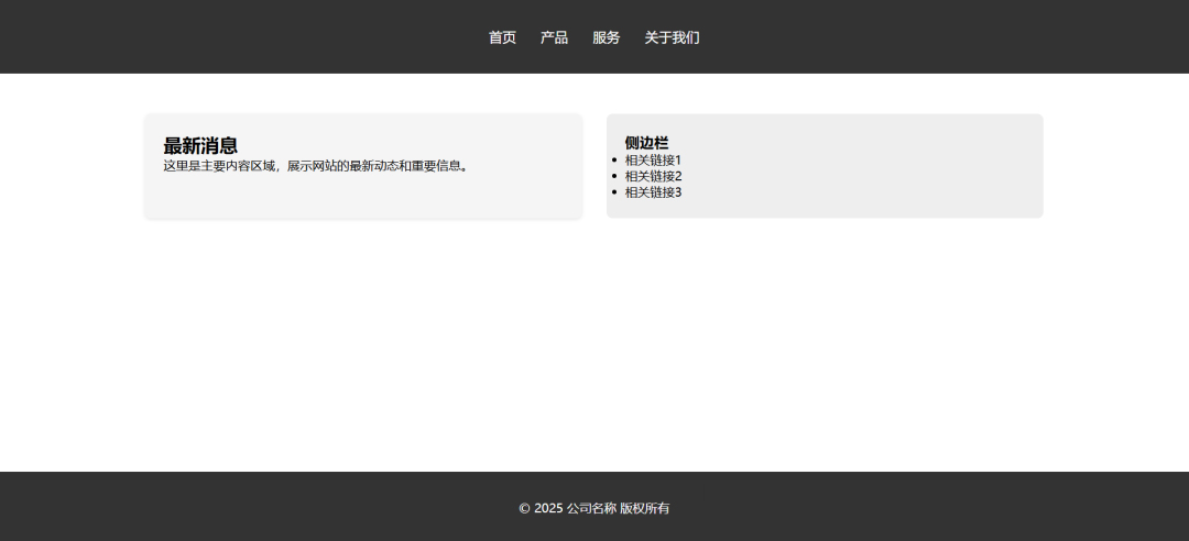
这个示例包含以下响应式功能:
视口设置
<meta name="viewport">标签确保移动端正确缩放流动布局
使用 max-width: 1200px限制最大宽度margin: 0 auto实现水平居中媒体查询
桌面(≥768px):使用网格布局 移动端(<768px):导航栏垂直排列 弹性盒子
导航栏使用 display: flex支持不同屏幕尺寸下的排列方式 网格布局
grid-template-columns: repeat(auto-fit, minmax(300px, 1fr))自动创建响应式列响应式图片
max-width: 100%确保图片不超过容器宽度
场景 2:全屏背景
<!DOCTYPE html>
<html>
<head>
    <title>全屏背景</title>
    <style>
      /* 重置默认边距 */
      * {
        margin: 0;
        padding: 0;
      }

      /* 全屏容器 */
      .fullscreen {
        height: 100vh; /* 视口高度 */
        width: 100vw; /* 视口宽度 */
        background: #2196f3;

        /* 内容居中 */
        display: flex;
        flex-direction: column;
        justify-content: center;
        align-items: center;
        color: white;
      }

      /* 文字样式 */
      h1 {
        font-size: 3rem;
        margin-bottom: 1rem;
        text-shadow: 2px2px4pxrgba(0, 0, 0, 0.3);
      }
      p {
        font-size: 1.2rem;
        max-width: 80%;
        text-align: center;
      }

      /* 移动端优化 */
      @media (max-width:768px) {
        h1 {
          font-size: 2rem;
        }
        p {
          font-size: 1rem;
        }
      }
    </style>
</head>
<body>
    <div class="fullscreen">
      <h1>我是背景</h1>
      <p>窗口高度始终占满屏幕,内容自动居中</p>
    </div>
</body>
</html>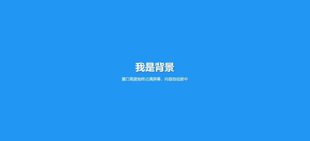
<!DOCTYPE html>
<html>
<head>
    <title>等间距网格布局</title>
    <style>
        /* 重置默认样式 */
        * {
            margin: 0;
            padding: 0;
            box-sizing: border-box;
        }

        /* 容器布局 */
        .container {
            max-width: 1200px;
            margin: 2rem auto;
            padding: 01rem;
        }

        /* 网格系统 */
        .grid {
            display: grid;
            gap: 1.5rem;  /* 核心间距控制 */
            grid-template-columns: repeat(auto-fit, minmax(280px, 1fr));
        }

        /* 网格项样式 */
        .card {
            background: #fff;
            border-radius: 8px;
            padding: 1.5rem;
            box-shadow: 02px8pxrgba(0,0,0,0.1);
            transition: transform 0.3s ease;
        }

        .card:hover {
            transform: translateY(-4px);
        }

        /* 响应式断点 */
        @media (min-width:768px) {
            .grid {
                grid-template-columns: repeat(2, 1fr);  /* 平板两列 */
            }
        }

        @media (min-width:1024px) {
            .grid {
                grid-template-columns: repeat(3, 1fr);  /* 桌面三列 */
            }
        }
    </style>
</head>
<body>
    <div class="container">
        <div class="grid">
            <div class="card">
                <h2>卡片 1</h2>
                <p>这是一个自适应网格项,内容自动换行保持等间距</p>
            </div>
            <div class="card">
                <h2>卡片 2</h2>
                <p>使用 CSS Grid 实现的等间距布局</p>
            </div>
            <div class="card">
                <h2>卡片 3</h2>
                <p>响应式断点适配不同屏幕尺寸</p>
            </div>
            <div class="card">
                <h2>卡片 4</h2>
                <p>支持任意数量的网格项</p>
            </div>
            <div class="card">
                <h2>卡片 5</h2>
                <p>间距始终保持一致</p>
            </div>
            <div class="card">
                <h2>卡片 6</h2>
                <p>完美适配移动端和桌面端</p>
            </div>
        </div>
    </div>
</body>
</html>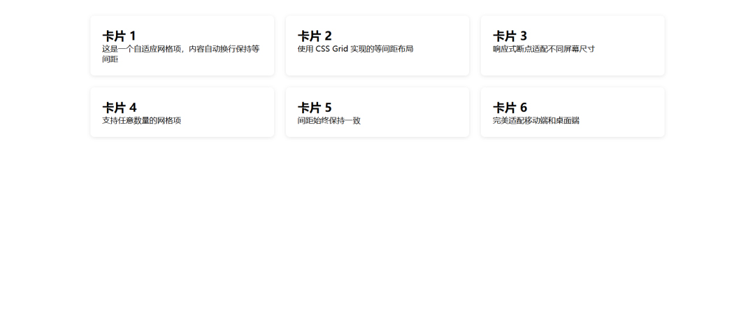
<!DOCTYPE html>
<html lang="zh-CN">
<head>
    <meta charset="UTF-8">
    <meta name="viewport" content="width=device-width, initial-scale=1.0">
    <title>最佳文本可读性案例</title>
    <style>
        /* 基础重置 */
        * {
            margin: 0;
            padding: 0;
            box-sizing: border-box;
        }

        /* 页面容器 */
        .article-container {
            max-width: 65ch;  /* 最佳行宽:约65字符 */
            margin: 3rem auto;
            padding: 01.5rem;
            font-family: -apple-system, BlinkMacSystemFont, "Segoe UI", Roboto, "Helvetica Neue", Arial, sans-serif;
            line-height: 1.6;
            color: #333;
        }

        /* 标题排版 */
        h1 {
            font-size: 2.5rem;
            line-height: 1.2;
            margin-bottom: 1.5rem;
            color: #222;
        }

        h2 {
            font-size: 1.8rem;
            margin: 2rem01rem;
            color: #2c3e50;
        }

        /* 段落样式 */
        p {
            margin-bottom: 1.5rem;
            text-align: justify;
            hyphens: auto; /* 自动连字符 */
        }

        /* 列表优化 */
        ul, ol {
            margin: 1rem0;
            padding-left: 2rem;
        }

        li {
            margin-bottom: 0.5rem;
        }

        /* 强调文本 */
        strong {
            color: #2c3e50;
            font-weight: 600;
        }

        em {
            font-style: italic;
            color: #666;
        }

        /* 响应式调整 */
        @media (max-width:768px) {
            .article-container {
                font-size: 1rem;
                line-height: 1.5;
            }

            h1 {
                font-size: 2rem;
            }

            h2 {
                font-size: 1.5rem;
            }
        }

        /* 打印优化 */
        @media print {
            .article-container {
                max-width: none;
                color: #000;
                font-family: "Times New Roman", serif;
            }
        }
    </style>
</head>
<body>
    <article class="article-container">
        <h1>网页排版最佳实践指南</h1>
        <p>在数字时代,良好的排版设计对于提升阅读体验至关重要。</p>

        <h2>核心原则</h2>
        <ul>
            <li>行宽控制在45-75个字符之间</li>
            <li>使用1.5-1.8倍行高提升可读性</li>
            <li>确保足够的文本对比度(WCAG AA标准)</li>
            <li>优先选择适合屏幕阅读的字体</li>
        </ul>

        <h2>技术实现</h2>
        <p>现代CSS提供了强大的排版控制能力。通过<code>max-width: 65ch</code>可以精确控制段落宽度,其中<em>"ch"</em>单位代表字符"0"的宽度。结合<code>text-align: justify</code>和<code>hyphens: auto</code>可以实现自动对齐和智能断字。</p>

        <p>响应式设计方面,使用<code>rem</code>单位配合媒体查询,可以在不同设备上保持文字比例协调。例如在移动端适当缩小字号,同时保持行高比例不变。</p>
    </article>
</body>
</html>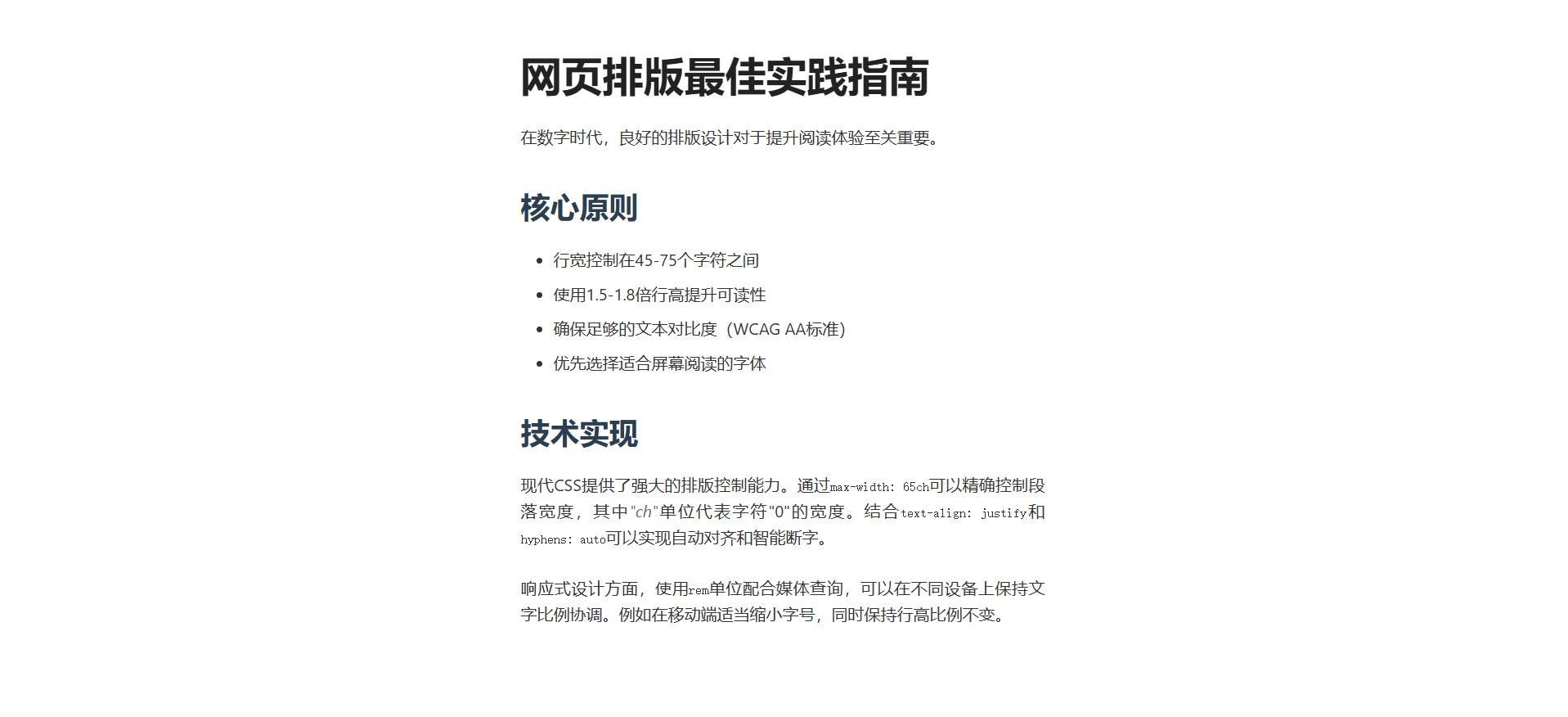
关键可读性优化点:
行宽控制
max-width: 65ch; /* 1ch=字符"0"的宽度 */
实现约65字符/行的黄金阅读宽度 避免长文本行造成的视觉疲劳
行高优化
line-height: 1.6; /* 1.5-1.8倍最佳 */
确保足够的垂直呼吸空间 提升行间导航的视觉引导
字体选择
font-family: -apple-system, ... sans-serif;
使用系统默认字体栈 平衡性能和可读性 支持中日韩字符显示
响应式调整
@media (max-width: 768px) {
  font-size: 1rem;
}
移动端适当缩小字号 保持行高比例不变
智能断字
hyphens: auto;
自动处理英文单词换行 保持段落边缘整齐
打印优化
@media print {
  font-family: "Times New Roman";
}
打印时切换衬线字体 提升纸质阅读体验
三、避坑指南
1. em 的继承陷阱
问题:多层嵌套时尺寸叠加
解决:优先用 rem,em 仅用于局部(如按钮图标对齐)
.btn {
  font-size: 1.6rem;
  padding: 0.8em 1.2em;  /* 基于当前字体:12.8px/19.2px */
}
2. vh 的移动端适配
问题:iOS Safari 地址栏导致 100vh 超出屏幕
解决:用 JS 动态设置高度或 CSS 新特性
.modal {
  height: 100vh;
  height: -webkit-fill-available; /* iOS 适配 */
}
3. 像素级精度控制
场景:1px 边框在高清屏显示问题
解决:使用伪元素 + transform
.border-thin {
position: relative;
}

.border-thin::after {
content: "";
position: absolute;
top: 0;
left: 0;
width: 200%;
height: 200%;
border: 1px solid #000;
transform: scale(0.5);
transform-origin: 00;
}