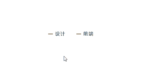
整体效果
知识点:
1、 :before 和 :after 伪元素选择器
2、 transition 过渡属性
3、 max-content 内容最大宽度属性
4、 transform 变形属性
思路:
利用伪元素,组合成一个小横线,利用鼠标状态,让小横线过渡成向下箭头,表示有隐藏内容。
适用于有二级或者三级内容的导航。
核心代码部分,简要说明了写法思路;完整代码在最后,可直接复制到本地运行。
核心代码
html 代码
<nav class="nav84">
  <a href="javascript:;" class="nav-a84">设计</a>
  <a href="javascript:;" class="nav-a84">前端</a>
</nav>
a 标签主体。
css 部分代码
.nav84{
  position: relative;
  display: flex;
  justify-content: center;
  align-items: center;
}
.nav-a84{
  width: max-content;
  padding: 10px 8px 10px 32px;
  margin: 0 10px;
  font-size: 16px;
  line-height: 1;
  letter-spacing: 2px;
  color: #000;
  text-decoration: none;
  cursor: pointer;
  position: relative;
  display: block;
}
.nav-a84:before,.nav-a84:after{
  content: '';
  width: 10px;
  height: 3px;
  background-color: #888;
  position: absolute;
  left: 8px;
  top: 18px;
  transition: all 0.2s linear;
}
.nav-a84:after{
  left: 14px;
}
.nav-a84:hover:before{
  transform: rotate(45deg);
}
.nav-a84:hover:after{
  transform: rotate(-45deg);
}
1、定义 nav 标签基本样式及 flex 布局。
2、定义 a 标签基本样式,这里使用的定义宽度属性 width: max-content ,意为 a 标签宽度仅为内容最大宽度,以及 line-height: 1 来让内容垂直居中。
3、基于 a 标签创建 :before 和 :after 伪元素,定义基本样式,通过 position 定位属性,让两个伪元素组成一个小横线,同样加上过渡属性 transition: all 0.2s linear 。
4、利用 :hover 选择器,给 :before 和 :after 伪元素设置鼠标悬浮效果,让两个伪元素通过变形 transform 属性,让小横线变形成一个向下的箭头就可以了 。
完整代码如下
html 页面
<!DOCTYPE html>
<html lang="zh">
  <head>
    <meta charset="utf-8">
    <link rel="stylesheet" href="style.css">
    <title>动态箭头导航栏</title>
  </head>
  <body>
    <div class="app">
      <nav class="nav84">
        <a href="javascript:;" class="nav-a84">设计</a>
        <a href="javascript:;" class="nav-a84">前端</a>
      </nav>
    </div>
  </body>
</html>
css 样式
/** style.css **/
.app{
  width: 100%;
  height: 100vh;
  background-color: #fff;
  position: relative;
  display: flex;
  justify-content: center;
  align-items: center;
}
.nav84{
  position: relative;
  display: flex;
  justify-content: center;
  align-items: center;
}
.nav-a84{
  width: max-content;
  padding: 10px 8px 10px 32px;
  margin: 0 10px;
  font-size: 16px;
  line-height: 1;
  letter-spacing: 2px;
  color: #000;
  text-decoration: none;
  cursor: pointer;
  position: relative;
  display: block;
}
.nav-a84:before,.nav-a84:after{
  content: '';
  width: 10px;
  height: 3px;
  background-color: #888;
  position: absolute;
  left: 8px;
  top: 18px;
  transition: all 0.2s linear;
}
.nav-a84:after{
  left: 14px;
}
.nav-a84:hover:before{
  transform: rotate(45deg);
}
.nav-a84:hover:after{
  transform: rotate(-45deg);
}
页面渲染效果
以上就是所有代码,以及简单的思路,希望对你有一些帮助或者启发。